Enhance search & browsing.
In 2022, we launched an improved search and browsing experience on Shopee local service to help users find the deals that are just right for them. Our ADO improved by 62.1% a month after launch.
Product Designer, 2022
Due to non-disclosure agreements, some of the data has been purposely omitted.
Best local deals anywhere, anytime.
6 in 10 users drop off before reaching the product detail pages.
1 country, 8 interviews, 3 days.
Users are highly influenced by distance and location of stores.
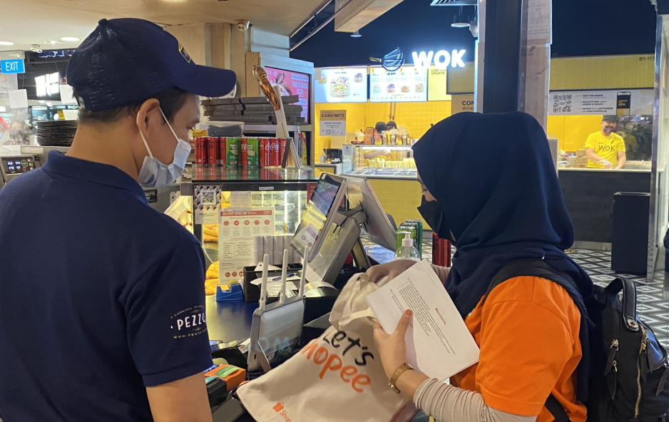
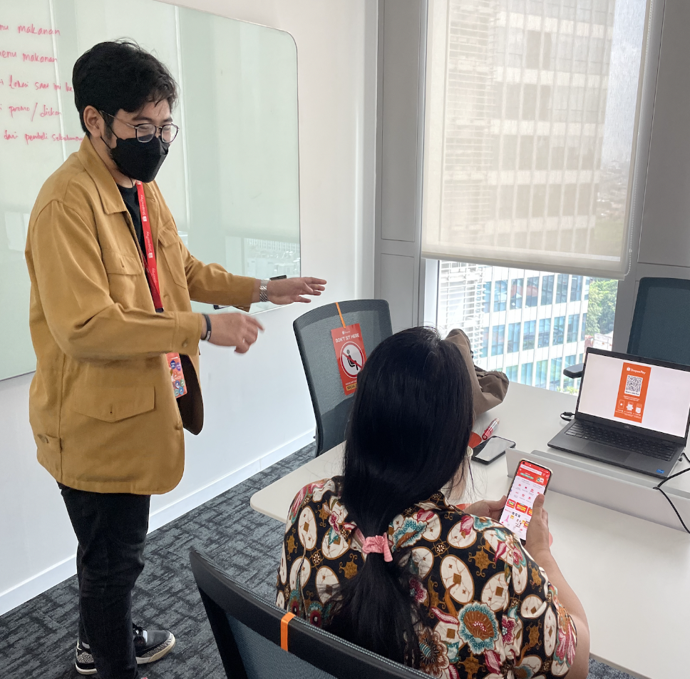
In our research interviews, we spoke to 8 users and did observational studies at our merchant's stores.
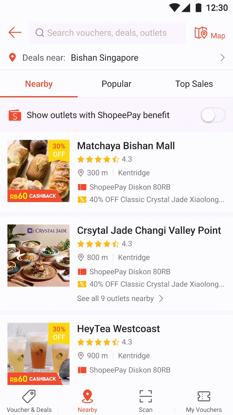
Nearby first.
When we saw how users browse Shopee's local service, we found that users are more sensitive to stores with deals that are nearby them.
More than food.
Users look out for deals that are not just food-related but beauty, retails, electronics, etc.
Stores & brands.
Users have a strong affinity towards familiar stores and brands that are household names.
As a user, I care about distance and location of stores for me to enhance my purchase and redemption experience on Shopee local service.
I focused on quick reiterations and concept testing during the design stage.
Given that time and resources are tight, as the sole product designer, I first tested the concept that I gathered in the research and did several rounds of design thinking exercises together with my product managers before arriving at a solution.
Testing my hypothesis.
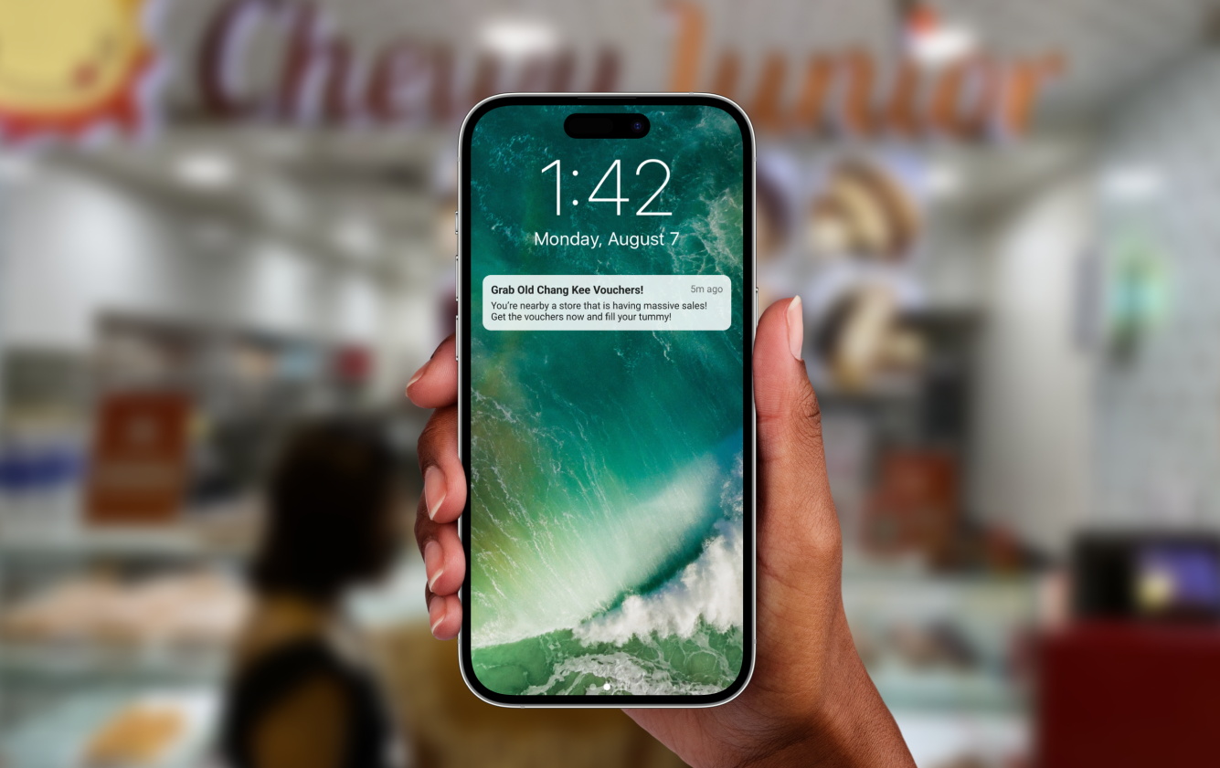
Knowing users have a strong affinity for location and distance, I used a low-effort testing plan to send push notifications to users when they are near local service stores.
Affinity mapping insights.
I conducted a design workshop with our internal design team together with some PMs to align on our insights and next steps.
Low fidelity internal alignments.
Before the idea came to fruition, an ample amount of time was spent on ideating, conceptualising, and aligning with our stakeholders.

7 usability testings.
Relying on our local PM and customer experience team, we recruited participants for our first round of usability testing.
With the insights gathered along the way, the team and I weaved each findings into our design solution.
Design for convenience. Design for comfort. Design for simplicity.
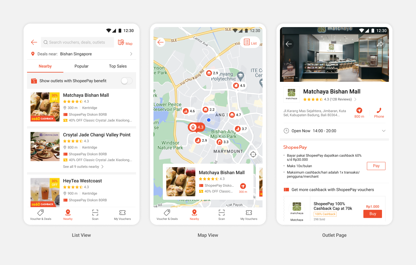
Bringing you a new way to browse.
This map view concept came to me when I realised users want a way to find good deals near them so they can quickly purchase and use.
Accomodate to your curiosity to explore.
In our usability testing, we found out users would also like to explore stores near landmarks in the map.
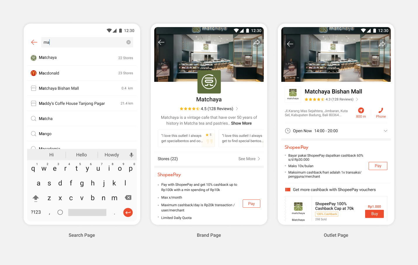
Let's make your search more intuitive.
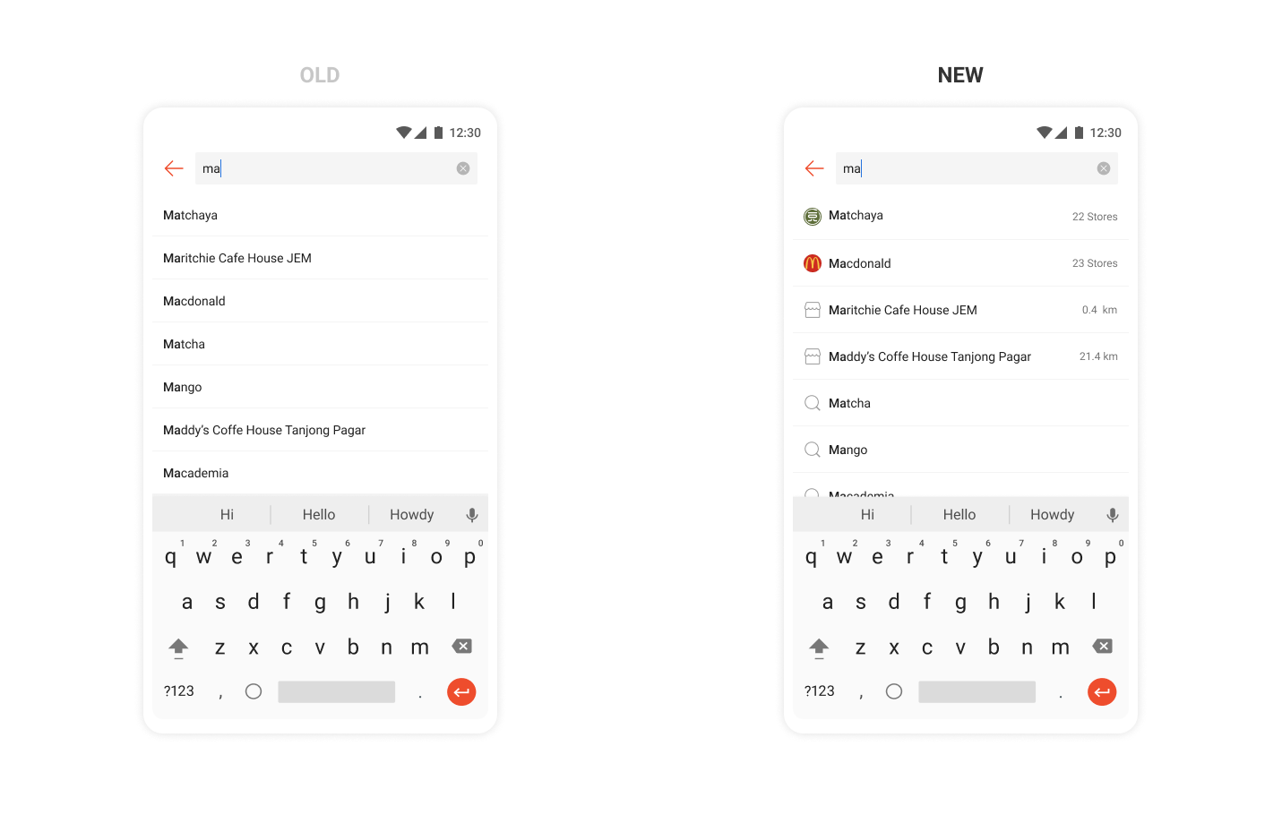
In the past, our search page consists of many different types of search terms - brand, store, and random keywords. The previous design increases users’ need to process the recommended keywords. Instead, we want to help users’ visually distinguish the content to make search simpler and more intuitive.
A tap toward greater potential with map view.
62.1% improvement in order rate. Browsing from map view contributes to the highest conversions.
.gif)